Nº 010 / 348
冬至の宴
Winter Solstice Feast
Nº 010 / 348 · 冬至の宴 · Winter Solstice Feast
What colors go with red (and why plain black falls short)
Sanzo Wada’s combination Nº 010 has spent ninety years solving the color everyone’s most scared of.
Red is intimidating. Most people leave it at the bottom of the drawer because they don’t know what to pair it with, and when they finally go for it they throw it on with plain black. Safe, sure. And boring. Red with black isn’t bad, it’s unfinished: it’s missing the tone that makes it look like a decision and not an accident.
In 1933, Japanese painter Sanzo Wada published a dictionary of 348 color combinations. Number 010, Winter Solstice Feast, solves red better than most people do today. And it does it with four tones, not two.
The palette
Here they are: ivory (#F2E8D5), a clean, warm red (#C9171E), jet black with a cool edge (#2C2C38), and a fourth one that’s where all the magic is, the Rikyu Tea (#A09060), a muted green with a brown undertone, the color of a matcha that’s been sitting out of the cup for a while.
Three of those four you’d have guessed. The green tea, no. And it’s exactly the one that makes the combination work.
Why it works
Red and green are opposites on the color wheel. Put them both at full volume and they vibrate, they clash, they give you a headache: that’s the Christmas effect. But Wada doesn’t use a full-volume green. He uses one desaturated and warmed until it’s almost a brown. And here’s where something happens: that green is still the complement of red, so it balances it, but being muted it no longer competes with it. It turns the volume down. Red stops shouting and starts looking chosen.
The ivory acts as air. It’s a warm white, same family as the rest, so it doesn’t cut the palette off cold the way a pure white would; it lets it breathe. And the black, which leans slightly blue, anchors the whole set and brings in the one cool note, just enough to keep the warmth of the other three from getting cloying.
The result is a warm-temperature palette with a single cool anchor. Balanced without being symmetrical. That’s why it holds up ninety years later.
How to wear it without looking like a costume
The trap with any palette is copying it in equal parts. Don’t. Proportions rule:
- The red, in a single piece. A sweater, a skirt, a pair of sneakers. It’s the accent, not the base. The moment you spread it across two or three garments, it stops being an accent and turns into a fright.
- The ivory, as base. Pants, a shirt, whatever takes up the most surface area. It’s the canvas.
- The black, in the finishing touches. Shoes, a bag, a belt. Anchor it from the outside.
- The green tea, as bridge. Here’s the nuance almost nobody would reach for: a tea-colored coat, khaki pants, an accessory. It’s what separates “I put on red” from “I know what I’m doing.”
It works by day with the ivory dominating and the red as a wink. And by night turning up the black and letting the red take the lead. Same palette, two volumes.
If red isn’t your thing
There’s another way to wear red, a colder one: combination Nº 001, Dawn Sky, takes it to crimson and seats it next to a deep indigo. Less warmth, more drama. If Nº 010 is a winter dinner, Nº 001 is the sky half an hour before the sun comes up.
What’s actually hard
All of this sounds easy written down. Standing in front of your wardrobe at eight in the morning, it isn’t: your head files clothes under “the red sweater,” not under “the red I own wants an ivory and a green tea next to it.” Color doesn’t show on the hanger. It shows in the outfit.
If you’ve got something red parked in your wardrobe, scan it in Outfinder: it reads the garment’s true color and tells you which of your things plays the ivory, which plays the anchor, and which plays that green tea you’d never have thought of. The theory is from 1933. The dirty work is done by the app.
Looks in this palette
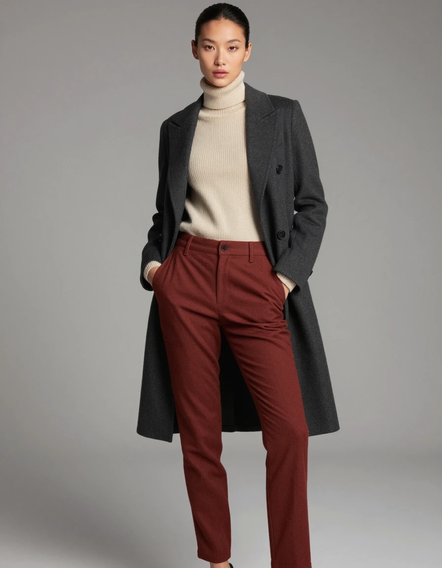


Interpretations of the palette, for reference.