Nº 239 / 348
深碧の間
Deep Azure Room
Nº 239 / 348 · 深碧の間 · Deep Azure Room
What Goes With Navy, Beyond White
Sanzo Wada’s combination Nº 239 takes navy, the most sensible color of them all, and instead of lightening it, goes deeper.
Navy is the black worn by people with taste: a dark neutral that flatters better than black, anchors any outfit, and never goes out of style. The problem isn’t what it goes with, it goes with almost everything, it’s that we always play it safe: navy with white, navy with denim, done. Correct and forgettable.
In 1933, the Japanese painter Sanzo Wada published a dictionary of 348 combinations. Number 239, Deep Azure Room, does what nobody dares to do with navy: instead of cutting it with something light, it sinks it further. Three dark blues, not one pale breath.
The palette
Three tones, all three deep: the Indigo base (#164A84), a more saturated and electric Lapis Lazuli (#2050A0), and a near-black gray, the Charcoal (#424242). No white. Nothing that rests.
Why it works
Every combination theory tells you that you need contrast in lightness: a light and a dark so the eye can breathe. Wada breaks the rule and shows you why deep monochrome holds up just as well.
The trick is that here the contrast doesn’t come from lightness, it comes from saturation. The Indigo is deep but muted; the Lapis Lazuli is just as dark but much purer, almost electric. That difference in intensity, not in lightness, is what separates the pieces and keeps the outfit from turning into one flat block. It’s contrast, just a different kind.
And there’s weight underneath: the Indigo carries its lineage of aizome, the Japanese dye, and of denim. It’s a blue with centuries of craft behind it. That’s why it holds up worn at full volume without looking like a little sailor uniform.
How to wear it
- Navy as the base. Here it runs the show: suit, pants, coat, the darkest denim. It’s the canvas, not the accent.
- Lapis Lazuli as the accent. A single piece, the one that pops against all that blue: a sweater, a scarf, a bag. Brighter than the rest, it’s the only point that jumps.
- Near-black gray as the anchor. In the finishing touches: shoes, belt. It closes the outfit without dropping in a flat black.
By day, the Indigo leads and the Lapis Lazuli is a flash. By night, everything sinks and the outfit turns into an almost solid nocturnal blue. Same palette, two depths.
If navy wants a hit of warmth
Here navy plays it cold, tone on tone. If what you want is for it to anchor a warm color instead of more blue, Wada uses a similar dark blue to seat a gold in Nº 077: the same deep-anchor role, a different temperature beside it.
What’s actually hard
You’ve definitely got navy, it’s the most common garment in the wardrobe. What you don’t know is that instead of the eternal white, it asks for another, livelier blue next to it and a deep gray to close it off. The problem is that the color doesn’t read on the hanger: navy and Lapis Lazuli, hung up, look almost the same. Together, they don’t.
Scan your wardrobe in Outfinder and it tells you what you’ve got to pair with navy beyond the safe move. The most versatile neutral you already own, finally off autopilot.
Looks in this palette
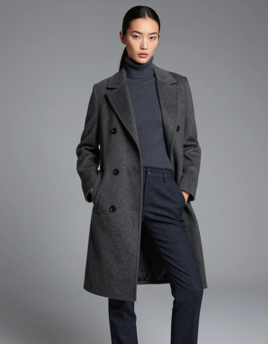
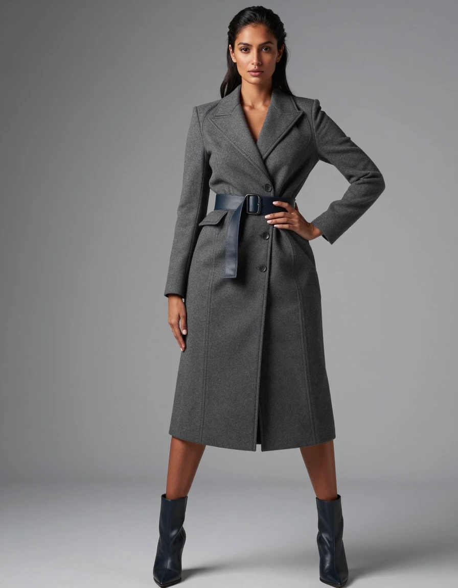

Interpretations of the palette, for reference.