Nº 038 / 348
鼠の調べ
Mouse Gray Harmony
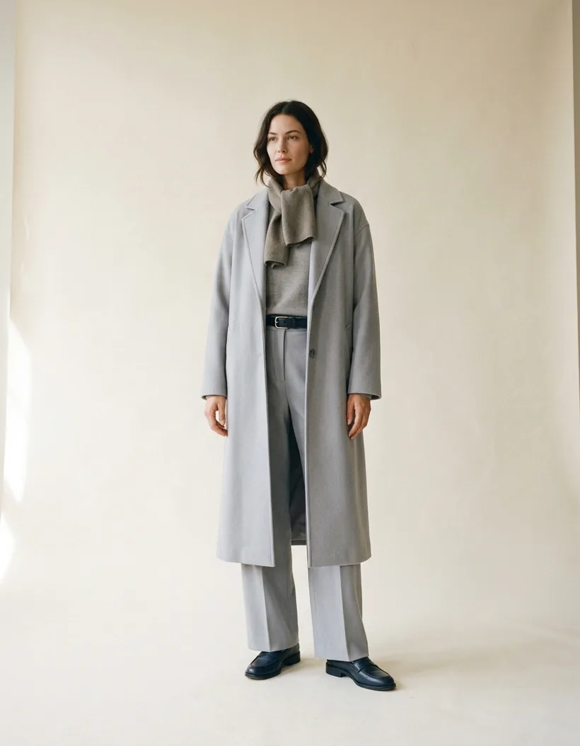
Nº 038 / 348 · 鼠の調べ · Mouse Gray Harmony
A monochrome outfit isn’t one color: it’s one tone
Spoiler: almost every monochrome outfit you see on the street fails for the same reason.
Monochrome has a reputation for being easy. Pick a color, repeat it, done. That’s where it goes wrong: repeating a color isn’t monochrome, it’s a uniform.
Real monochrome is something else. You play the tone, not the color.
The mistake
You pick blue. Blue shirt, blue sweater, blue jeans. Result: three different blues arguing with each other and none of them in charge. You look like you got dressed in the dark.
It happens because color is not the only thing that changes in a garment. Value changes (how light or dark it is), chroma changes (how loud it is), and temperature changes (warm or cool). Three blues from the same wardrobe can agree on the name and share nothing else.
The rule
Wada had a whole folder of palettes like this. Of his 348 combinations, 53 carry no loud color at all: they’re tonal. Nothing shouts, and that’s the point.
Look at Nº 038, Mouse Gray Harmony: a pale mouse gray (#B0B8C8), an iron navy (#2E2E3A), and a warm mouse gray (#989078). Not one of the three goes past 13% chroma. Not one.
And the palette still works, because there’s a 50-point value jump between lightest and darkest. You don’t read “three grays”. You read a light gray, a mid gray, and something almost black. In order.
That’s the rule: monochrome isn’t about repeating, it’s about stepping.
How to build it
Three pieces, three values, one tone. Any more is soup.
- Light on top or bottom. Your big surface: the coat, the trousers, the dress. Most of the fabric lives here.
- Mid in the middle. The knit, the shirt, the piece the eye crosses on the way. It’s the bridge, and it’s where you gamble: if the mid sits too close to the light, the two merge and the outfit goes flat.
- Dark at the edges. Shoes, belt, bag. In Nº 038 the navy does that job. Without it, the whole thing floats.
- And nothing else. No white sneakers, no colored accessory, no contrasting belt. Anything that steps in there stops being monochrome and becomes one color with three grays behind it.
The shortcut to knowing if you got it: look at the photo in black and white. If it still reads as ordered, the palette holds. If it turns into a smear, you’re missing a step.
The temperature trap
This is where monochrome falls apart without you noticing.
The three tones of Nº 038 aren’t the same temperature: the pale one and the navy lean blue, the mouse gray leans warm. That’s exactly why it works: the warm one stops the outfit from looking like a hospital corridor.
Build it from three pure cools and it turns clinical. Build it from three warms and it turns muddy. Put one from the other side in the mid value, and the eye reads it as intent.
One last thing
Monochrome is the cheapest look to fix and the one that gets the most out of what you already own. You don’t need to buy anything. You need to read the values of what’s already hanging in your wardrobe.
Scan two of your grays and the app tells you whether they sit at the value distance a palette like this asks for, or so close they’ll merge. That is, literally, the difference between looking expensive and looking careless. And we tell the opposite story with brown in Nº 042: when the trick isn’t repeating the color, but lighting it up.