Nº 042 / 348
夜の砂漠
Desert Night
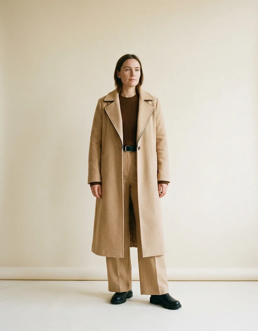
Nº 042 / 348 · 夜の砂漠 · Desert Night
What goes with brown: the one that lights up once you stop calling it neutral
In Wada’s Nº 042, brown doesn’t play the neutral. It plays the accent, and it does it better than half your wardrobe.
Brown has a reputation for being sensible. A wardrobe staple, a winter camel, a color that won’t argue. In Nº 042 it does the opposite: it’s the liveliest piece in the palette. And it works.
The reason isn’t a mystery. Almost nobody puts it to use.
The palette
Three tones and not one more: a warm Sand (#E8C8A0), an earth Brown (#704214), and a blue-black Jet Black (#2C2C38). Sanzo Wada catalogued it in 1933 as 夜の砂漠, Desert Night, one of the 348 combinations he collected. Three tones is the dictionary’s most common size: 225 of the 348 carry exactly three.
Look at the split before you read on. Two warms and a near-neutral.
Why it works
Here the accent isn’t a loud color. It’s the most chromatic of the three, which is a different thing.
Sand and brown sit at practically the same point on the color wheel: both are muted oranges. Neighbors. What separates them isn’t hue, it’s value. Sand lands at 77% lightness, brown at 26%. Fifty points apart, two colors from the same family.
That gap is the whole palette. Brown reads as a piece because it’s down there alone, not because it’s showy. Swap it for a burgundy and the palette shouts. Swap it for another sand and the palette disappears.
Then black comes in to do the dirty work. Its chroma doesn’t reach 5%, so it competes with nothing: it only closes. Shoes, belt, the edge of the coat. Where brown states, black punctuates.
How to wear it
- Sand as the base. Big surface: the long coat, the trousers, whatever covers body. It’s the canvas and it’s more than half the outfit.
- Brown as the accent. One piece, one only. A chunky knit, tall boots, a jacket. Show up twice and it stops being an accent and the palette flattens.
- Black as the anchor. Shoes, belt, the handle of the bag. And one license that improves the whole thing: dark piping on the lapel. Black at the edges orders the silhouette without adding a fourth color.
Proportion matters more than it looks. Sand at 60%, brown at 30%, black for the last 10%. Brown at 60% and it’s no longer an accent, it’s a heavy garment.
Material moves the value, so read it before you commit. A brown in wool or suede sits darker than the same brown in cotton or linen. Put leather boots next to a cotton shirt of the very same brown and the boots will read almost black, which is handy: it hands you the anchor you were looking for without adding a fourth color.
Where it breaks
The classic brown mistake is stacking three different browns without opening up the value. Light camel, mid brown, dark tobacco, and half the gap you need. You end up with a smear.
The other way to break it is adding a fourth bright color “to wake it up”. A red accent over this palette cuts it in two.
If your skin runs warm, this trio flatters you without effort: warm sand and brown near the face, black below. If your skin runs cool, push the sand toward bone and pull the brown toward a less orange tone. Keep the value, change the temperature.
The brown you already own
Almost nobody needs to buy brown. What’s missing is the sand that gives it air and the black that closes it.
Before you go looking for new pieces, take stock of which browns you have and which light tones they live next to. Scan one and the app shows you, using the clothes already in your wardrobe, which Wada combinations it genuinely fits. Nº 042 is one of them, and it isn’t the only one.
Brown wears better than people think, and almost always with less brown than you’re wearing. If hard contrast is what you’re after, watch how Wada handles red in Nº 010: same principle of a muted accent, different starting point, and there plain black falls short. And if green is your problem, Nº 004 hands olive exactly the hinge job brown does here.