Nº 004 / 348
秋の庭
Autumn Garden
Nº 004 / 348 · 秋の庭 · Autumn Garden
What goes with olive green: the neutral nobody treats like one
Sanzo Wada’s combination Nº 004 treats olive for what it is: a neutral in disguise.
Olive green gets a bad rap for being difficult. It’s exactly the opposite. The problem is we treat it like a color with attitude when really it’s one of the most versatile neutrals out there. It’s just that nobody files it in the neutrals drawer.
Look at the facts: olive is, technically, a dark, desaturated yellow. That’s why it plays nice with almost everything, same as beige or gray. Wada’s combination Nº 004, Autumn Garden, proves it by handing olive the most neutral job there is: the hinge.
The palette
Four tones: a warm Eggshell (#F5E6CC), a half-power Gold (#C4A265), a near-midnight Dark Blue (#3A3A50), and the olive (#6B8E4E), the green that stitches the rest together.
Why it works
The trick is temperature. Olive and Gold are both warm and live close together on the color wheel: gold is a golden yellow, olive a muted yellow. They’re practically neighbors. That makes them analogous, and analogous colors read like a chord, not a clash.
Then the blue comes in. It’s the only cool note in the palette, and it does two things at once: it contrasts with the gold (which is nearly its complement) so the whole thing doesn’t fall asleep, and it orders the value from the edges. And olive, in the middle, plays bridge between the warmth of the gold and the cool of the blue: it’s the tone that keeps those two extremes from reading like a jump. The Eggshell, like in almost every Wada palette, brings the warm air that ties the rest together.
So you’ve got three warms in harmony and one cool that adds tension, with olive as the hinge. It’s the formula for fall: earth, gold, one dark piece. That’s why it flatters warm skin so much. If your skin leans gold or olive (check your veins: greenish?), this palette suits you straight out of the box.
How to wear it
In the Wada combo, the proportions go like this:
- Eggshell, as the base. The cream carries the big surface: pants, a skirt, the heavier coat. It’s the canvas.
- Gold, as the accent. A knit, an accessory, somewhere its half-power gold can light up without shouting (more camel than yellow). And matte, never shiny.
- Blue, as the anchor. Footwear, dark denim, a belt. It closes things out and brings the only cool note.
- Olive, as the bridge. In small format, the one that stitches the gold to the dark: a scarf, a sock, the garden wink.
And here’s the trick that changes everything: since olive is a neutral, you can flip the proportions. Bump it up to a big piece (olive pants, an overshirt, a coat) and the logic holds intact: the gold stays the warm accent, the blue the cool anchor, the cream the air. That’s why olive gives you so much to work with: it plays hinge or base without breaking a sweat.
By day, the cream and the olive carry the weight and the gold peeks through. By night, the dark blue rises and the gold turns to jewelry. Same palette, two registers.
If you want something else with green
If your green is brighter and less olive, the logic changes: a saturated green calls for muted complements, not analogous tones. But for olive, this is the play. And if what pulls you is strong contrast, look at how Wada builds red in Nº 010: same muted-complement principle, different starting point.
What’s actually hard
You already own the olive. Almost everyone has an olive garment sitting unused because they “don’t know what to wear it with.” Turns out it goes with half the wardrobe, because it’s a neutral: it can stitch a palette together or hold the whole thing up.
Scan it in Outfinder: it reads the true tone and shows you what in your own closet makes a chord with it, what works as your gold and what works as your anchor. Olive stops being the weird color and becomes the one that gives you the most range.
Looks in this palette
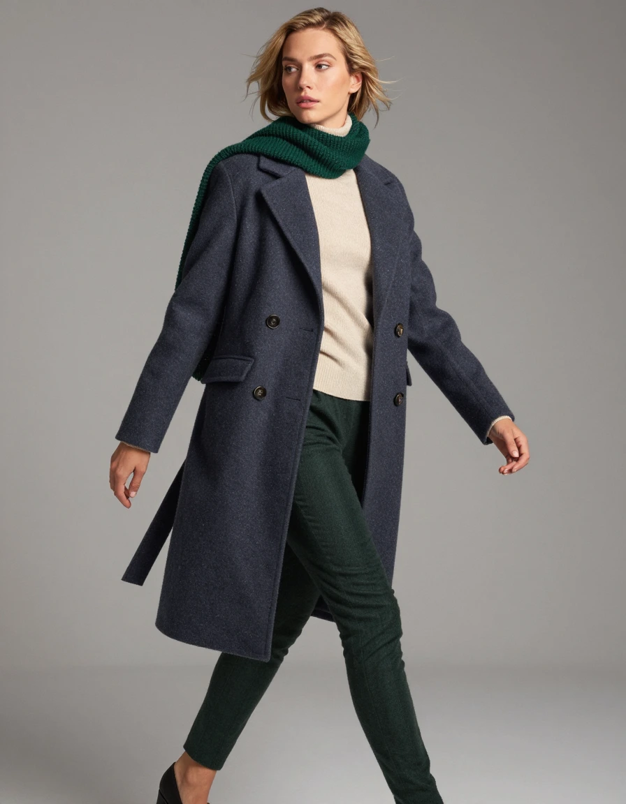
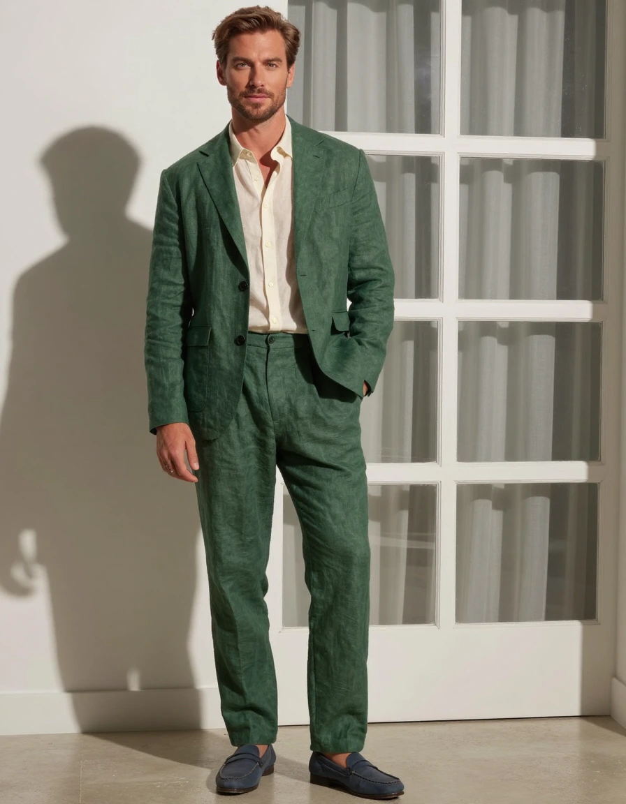
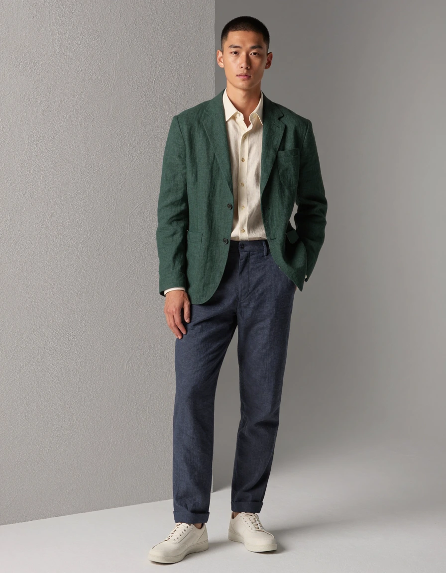
Interpretations of the palette, for reference.