Nº 020 / 348
雅の調べ
Elegant Melody
Nº 020 / 348 · 雅の調べ · Elegant Melody
What Goes With Pink (So It Reads Grown-Up, Not Sweet)
Sanzo Wada’s combination Nº 020 proves pink can be anything but sweet.
Pink drags a label around: sweet, childish, birthday-party. And it’s a shame, because muted pink, the kind that leans carmine or dusty rose, is one of the most grown-up, elegant tones out there. It all comes down to what you surround it with.
Wada’s combination Nº 020, Elegant Melody, surrounds it with cream, gray, and purple. And suddenly the pink turns serious.
The palette
Four tones: an eggshell (#F5E6CC), the muted carmine (#B5495B, a dusty pink-red), a bluish purple (#4A3A5C), and a warm gray (#787870).
Why it works
The key is that nothing here is turned up to full volume. Every color is desaturated, muted, “dirty” in the best sense. It’s what’s called a dusty palette, and it’s the signature of the sophisticated: the less a color shouts, the more expensive it looks.
The carmine is a red whose purity has been dialed down until it lands as grown-up pink. The bluish purple is its neighbor on the wheel, so they make a chord, not a clash. And the gray plays peacekeeper: the neutral that calms the strong colors without dulling them completely. The eggshell opens things up and gives air.
None of them shouts over the others. They coexist. That’s why the palette is called a melody: it’s a chord, not a solo.
How to wear it
- Eggshell, as base. The cream carries the big surface: pants, shirt, the heaviest coat. It’s the neutral canvas.
- Carmine, as accent. A single piece, the one that says pink without shouting it: a sweater, a dress, a bag. Because it’s muted, it leads without overwhelming.
- Bluish purple, as anchor. In the finishes or in one dark piece: shoes, belt. It adds depth and holds things down.
- Gray, as bridge. Small, the peacekeeper: a sock, a fine knit, the detail that stitches the outfit together without dulling it.
By day, the eggshell carries the weight and the carmine is the touch of color. By night, the purple comes up and the carmine takes the lead. Same palette, two volumes.
The secret to grown-up pink
If your pink runs bright (a fuchsia, a bubblegum), this palette isn’t for it: saturated pinks ask for a different strategy. But if you’ve got a dusty rose, a powder pink, an old rose, this is its crowd. And if you want to see carmine in a more high-contrast key, it shows up in Nº 010 as a full red.
What it actually takes
You almost certainly have a dusty-rose piece you never wear because it feels “too sweet.” It isn’t. It just needs gray and purple beside it to grow up.
Scan it in Outfinder and it’ll tell you whether you’ve got the grays and deep tones to bring out its serious side. The pink you’d written off could be your most elegant color.
Looks in this palette
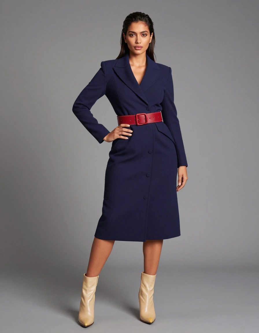
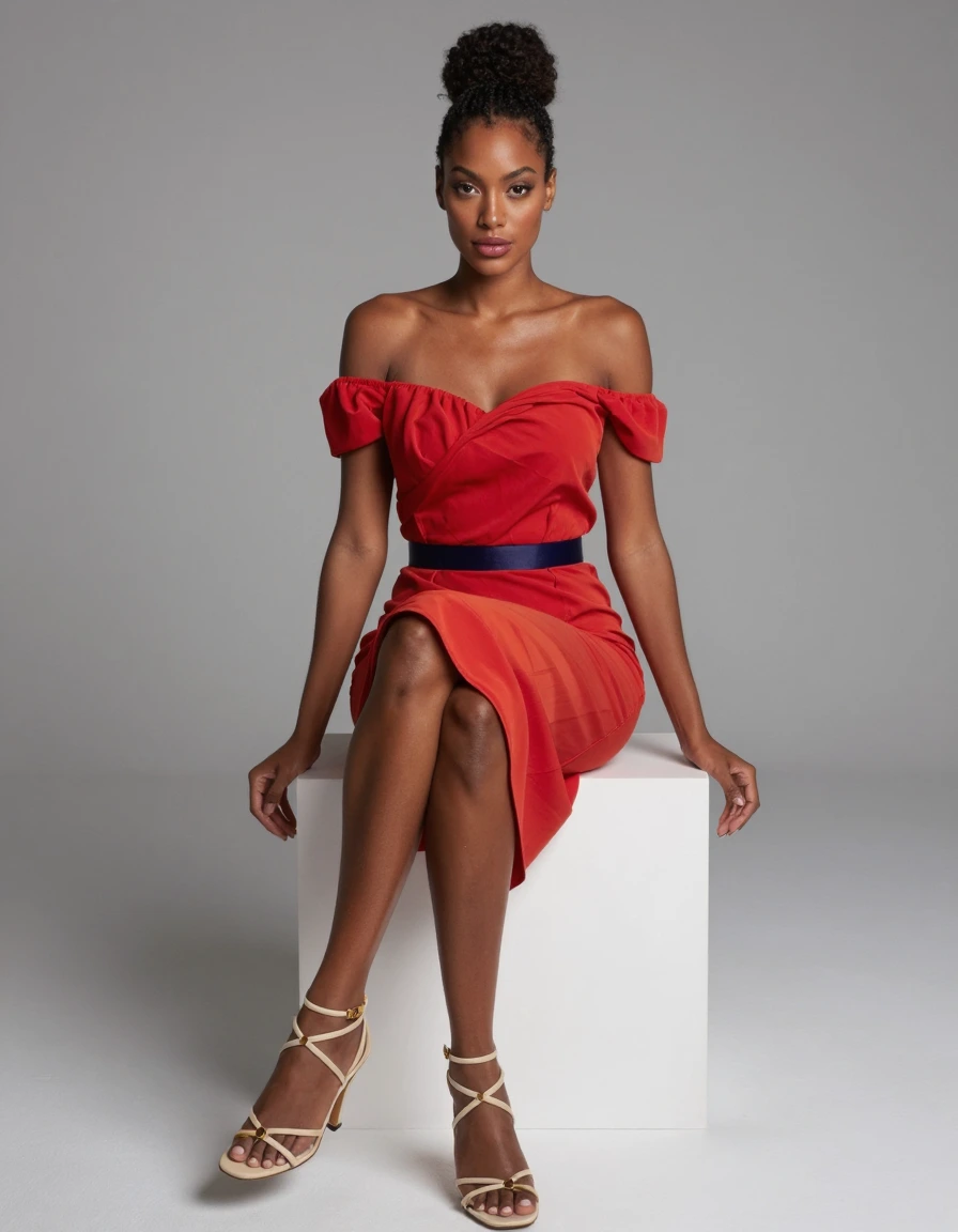

Interpretations of the palette, for reference.