Nº 318 / 348
瑠璃と紫
Lapis and Purple
Nº 318 / 348 · 瑠璃と紫 · Lapis and Purple
What Goes With Purple Without Looking Like a Costume
Sanzo Wada’s combination Nº 318 does the thing with purple almost nobody dares to try: it keeps it center stage and finds it an equal.
Purple is scary. We file it under costume, theater carpet, “too much.” And almost always the problem isn’t the purple itself, it’s what we put next to it: either a neutral that leaves it stranded, or a strong color from a different family that fights with it. Purple with the wrong partner screams. With the right one, it runs the show.
In 1933, the Japanese painter Sanzo Wada published a dictionary of 348 color combinations. Number 318, Lapis and Purple, solves it with the least obvious move: instead of a contrast, it finds it a relative.
The palette
Just two tones, both alive: a full purple (#9050C8) and a deeper lapis lazuli (#2050A0), that blue with so much violet inside it almost touches purple. They’re neighbors on the color wheel, two blue-violets at different depths.
Why it works
The usual move, with a color that scares people, is to cool it down with a neutral. Wada does the opposite: doubles down. He puts two colors from the same family, both saturated, and lets depth carry the contrast instead of tone.
It works because, sharing a root, both pull toward blue-violet, so they can’t clash, just like two notes in the same chord. But because one is lighter and more open and the other deeper and more closed, they don’t blur together or flatten out either. You get tension without a fight. It’s the difference between two people arguing and two people singing a duet.
And because neither one is a timid neutral, the whole thing doesn’t apologize. Purple stops being a nervous accent and becomes a decision.
How to wear it
Proportion sets the order: the light one spread wide, the deep one in a single spot.
- Purple as the base. This is where it takes the biggest piece: pants, jacket, the coat with the most body. It’s the backdrop, not the scare.
- Lapis lazuli as the accent. In one piece, the one that pops: a sweater, a shirt, a bag. Deeper than the purple, it works as the deep point without leaving the family.
- A neutral on the finishing touches. Wada’s palette is two colors, but an outfit asks for an anchor: close it out with dark shoes and a dark belt (a charcoal gray, a near-black leather) and let the two purples take the spotlight.
By day, purple dominates and the lapis lazuli is a wink. At night the lapis lazuli rises and the whole thing goes almost monochrome and deep. Same palette, two intensities.
If contrast is your thing
The purple in 318 plays tone on tone: instead of finding it a rival, it finds it an echo. If what pulls you is the clash of opposites, look at how Wada faces off real complementaries in Nº 010: a red and a muted green, another way to tame a color that commands the room.
What’s actually hard
You probably have a purple garment sitting unworn because “you didn’t know what to put with it.” The answer wasn’t a neutral to dull it, or a color from another family to challenge it: it was another blue-violet, one notch deeper. But you can’t see that at a glance on the hanger.
Scan it in Outfinder: it reads the garment’s true color and tells you whether you own the deep blue-violet that makes it pop, and which of your own pieces works as the anchor. Purple stops being the forbidden color and becomes the one that gives you the most character.
Looks in this palette
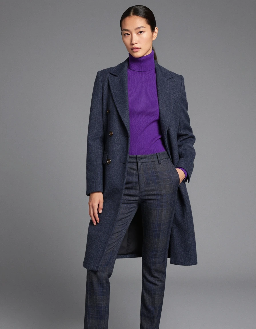
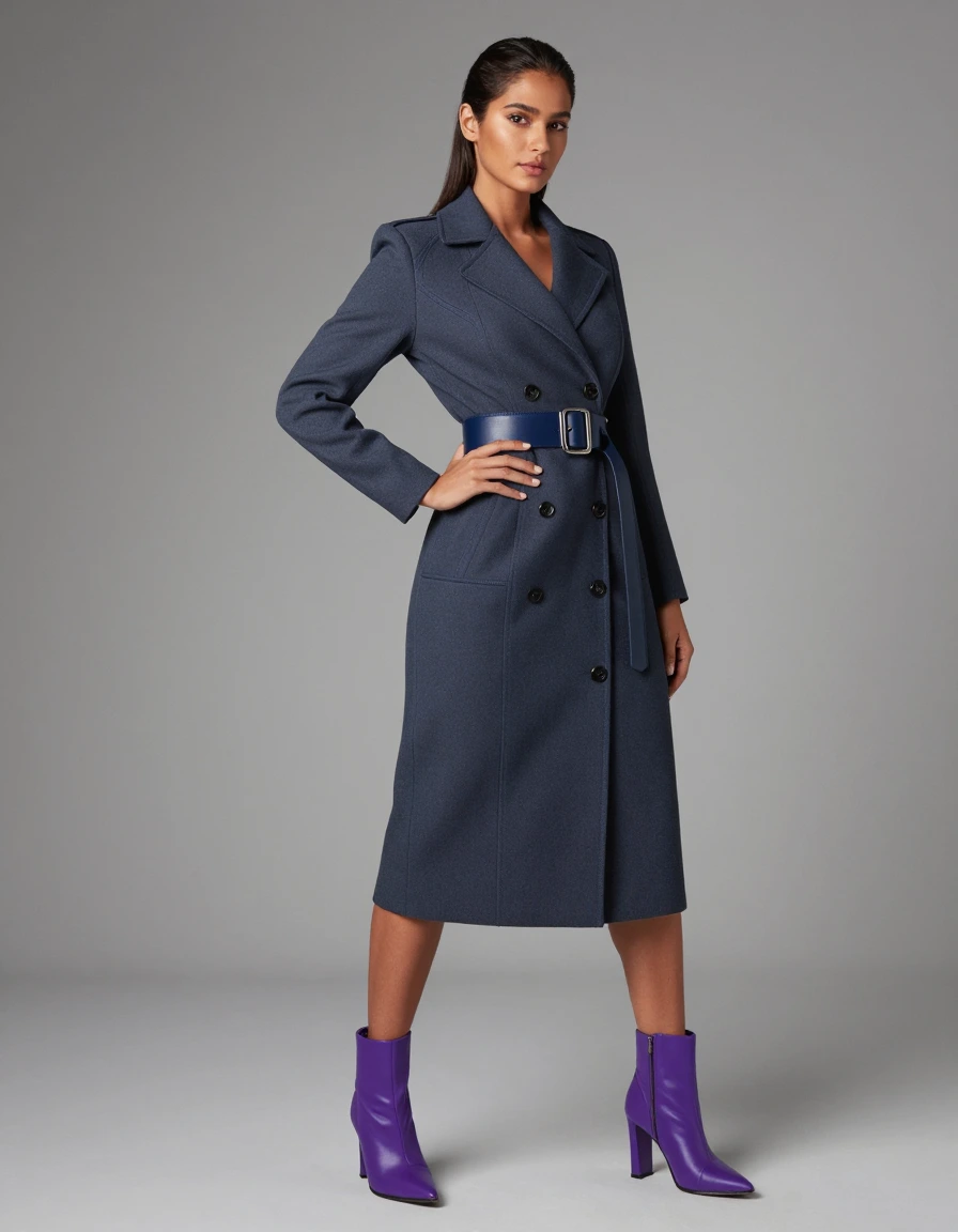
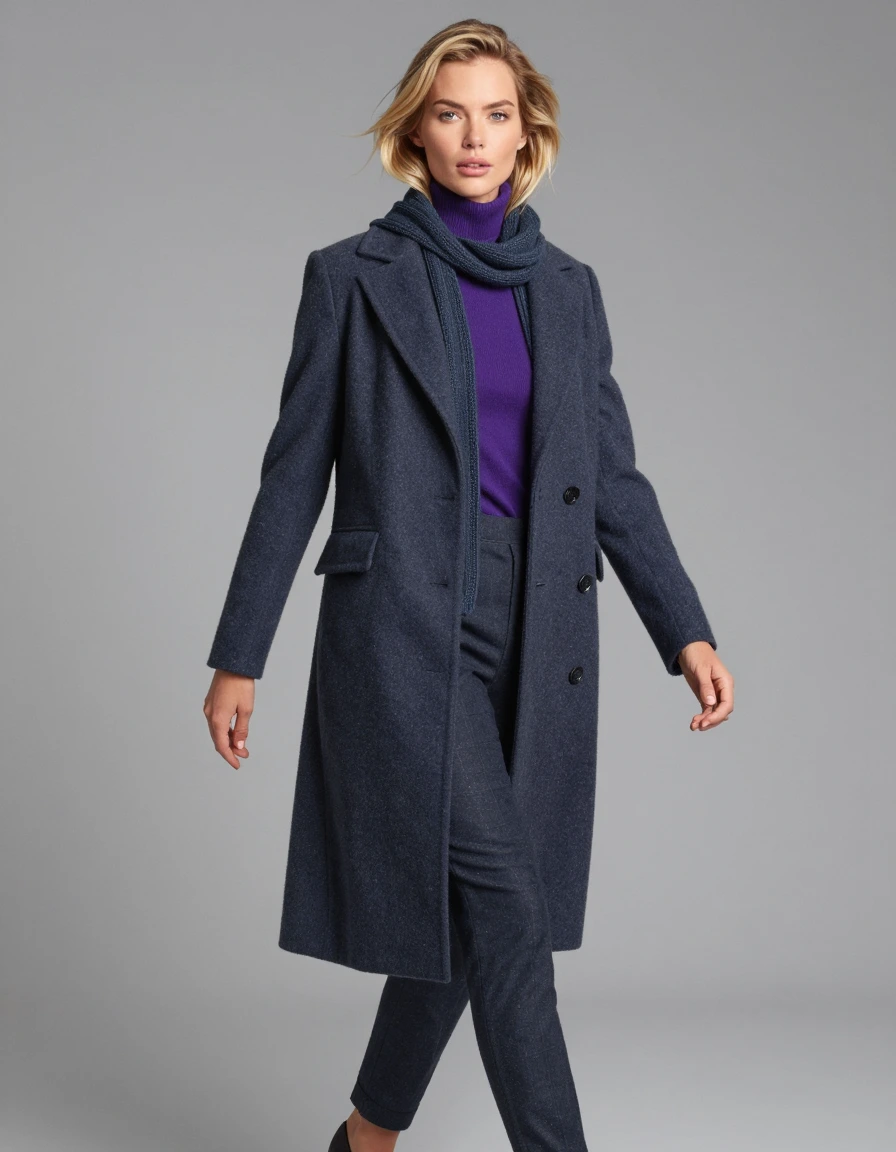
Interpretations of the palette, for reference.